My Role
Timeline
Team
React JS Developer, UX/UI Designer, Content Designer
Tools
Challenge
How can we create a comprehensive online platform that simplifies complex immigration and investment information for Indian High Net Worth Individuals (HNIs), while delivering a premium user experience?
The Problem
Tool Stack


The Solution

Our Approach
Phase 01 : Research and Brand Identity
Developing Personas
We identified that our primary users, Indian HNIs, value efficient, on-the-go services that minimize time spent on activities outside their routine.
Creating a Brand Identity
To appeal to our sophisticated target audience, we focused on developing a premium brand identity. This included:
Font selection
Color palette
Basic layouts
Phase 02 : Design and Component Development
Designing Layouts and Components
We iteratively tested various layouts and components, both in design mockups and browser development. This process helped us:
Understand component interactions
Ensure cohesive storytelling
Optimize first-time user experience
Interactive Hover Cards: Highlighting the most important information in a visually appealing layout
Information Architecture
On individual pages, the information architecture was designed such that it becomes more familiar to the user as they consume different pages of similar structure.
A page template was created for the ‘country’ pages which helped accommodate the content for immigration programs, basic information, eligibility criteria etc.
Different section oriented templates were utilized for the ‘investment’ service pages like pricing tables, service features, hero section etc.
Mega Menu: Navigating an information heavy website within seconds
Design & Development Strategy
Some ideas we implemented for team collaboration:
Divided all the information in smaller managable units
Designed a branded component for each of the unit
Each unit was defined in a way that fits together without the context of the content
This created repeatable units that could be designed and developed independently
This greatly increased design and development speed for the teams
It also helped create iterations faster for A / B Testing
Phase 03 : Frontend Development with React JS
How do we leverage React JS to create a dynamic and efficient user interface?
Component Structure
We used functional components with hooks for better performance and readability. Here's an example of our Australia component:
Responsive Design with CSS
We implemented responsive design using CSS media queries:
Phase 04 : Backend Integration and APIs
How do we integrate backend services to enhance functionality and data management?
Google Sheets API Integration
We used the Google Sheets API to manage dynamic content, allowing the client to easily update information without touching the codebase.
Email JS Integration
We implemented EmailJS to handle contact form submissions without a backend server:
Data Visualization with Google Charts
We used Google Charts to create interactive and responsive data visualizations:
Phase 05 : Deployment and Performance Optimization
How do we ensure fast, reliable, and scalable delivery of our web application?
Netlify Deployment
We used Netlify for continuous deployment, connecting it to our Gitlab repository for automatic builds and deploys on every push.
This helped with testing, building a iterative feedback loop within the team and rapid development.
AWS CloudFront & S3 for Asset Delivery
We leveraged AWS CloudFront and S3 for efficient delivery of static assets:
Key Takeaways
React Component Architecture: Utilizing a component-based structure improved code reusability and maintenance.
API Integrations: Google Sheets API and EmailJS allowed for dynamic content management and serverless form submissions.
Data Visualization: Google Charts enhanced the presentation of complex immigration and investment data.
Performance Optimization: AWS CloudFront and S3 significantly improved asset delivery speeds.
Continuous Deployment: Netlify and Gitlab integration streamlined our development and deployment workflow.
Final Product
Home Page
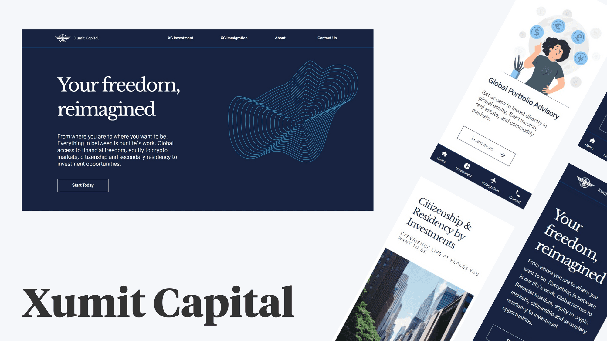
The home page clearly gives a glimpse of the value proposition to the customer. Designed to delight and engage customers with a simple interface and elegant layout.
Country Page
Designed with a focus on presenting complex and analytical information with simplicity, crucial in decision making for the customer.
Reflection
Talking to customers becomes crucial to build empathy, which helped us stay focused on user experience.
Building a design and technology first brand experience poses significant challenges, especially during the discovery phase. These challenges include building an understanding of the customer needs, testing technologies that provides the desired experience and creating the foundational design system that guides both design and development teams.


