Phone Depot

Services
Timeline
Team
Tools
The Problem
Accessing specific electronic parts and high-quality accessories poses significant challenges in the current market. Many users, particularly local mobile shop owners, face difficulties in sourcing genuine parts for repairs or bulk purchases.
The existing offline business model, while effective, suffers from inefficiencies in order documentation and management. The need for a centralized, streamlined online platform that simplifies this process and enhances accessibility is evident.
Challenge
How can we revolutionize gadget accessory shopping by providing a one-stop platform for individual parts and accessories?
The Solution
Phase 01
How can we address the challenges users face in accessing specific electronic parts and high-quality accessories in the current market?
Market Research
During the research phase, a thorough market analysis was conducted to identify existing platforms that offer similar services. The findings revealed a gap in the market—most existing platforms either functioned as directories or were generalized e-commerce sites lacking in specialization. There was no specific platform dedicated to providing detailed information, genuine parts, and a streamlined purchasing process for both accessories and individual repair components.
Key Insights
Purchase Behavior: Users often start with small or singular orders to test product authenticity before committing to larger purchases.
B2B Model Considerations: Customers, especially B2B clients, require immediate invoicing for GST amendments every two weeks.
Phase 02
Information Architecture
Understanding the user personas was critical. Two primary user flows were identified:
Accessory Shoppers: Users looking for mobile phone accessories, such as cases or screen protectors. The flow was designed to allow easy navigation by product type or brand, ensuring a seamless search and purchase experience.
Part Purchasers: Users seeking specific replacement parts, such as screens or hardware components. This flow was designed to allow users to search by device type, enabling quick access to the required parts.
Both follows same process to interact with platform.

Style Guide
When crafting the style guide, the aim was to maintain a design that is both simple and modern. This approach caters to a customer base that may be less design-oriented and more focused on the practical aspects of the task at hand.
The existing style embodies traits of accessibility, trustworthiness, engagement, and a modern aesthetic.

Wireframes and Mockups
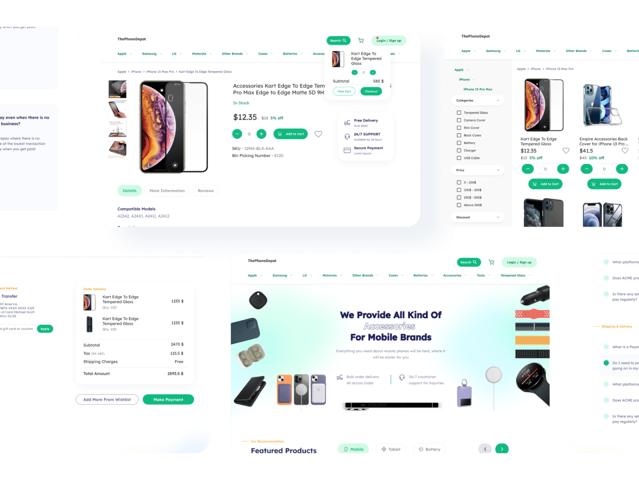
Using Figma, initial wireframes were created to visualize the user flows. The design prioritized a minimalistic and modern interface, ensuring that even non-design-oriented users could easily navigate the platform. Key features included:
Prominent Search Bar: Central to the user interface, allowing users to quickly find specific products.
Intuitive Navigation: A well-structured navigation bar that categorizes products by brand and type, ensuring users can easily find what they need.
Detailed Product Pages: Each product page was designed to provide comprehensive information, user ratings, and reviews, building trust and aiding in purchase decisions.
Phase 03
Prototyping and User Testing
The final designs were prototyped in Figma, with added micro-interactions to enhance user engagement. User testing was conducted with a small group to gather feedback on the overall experience. Key findings included:
Ease of Navigation: Users appreciated the clear and straightforward navigation, confirming that the design effectively prioritized user convenience.
Product Discovery: The prominent search bar and well-organized navigation allowed users to quickly find specific products, meeting the project's primary goal.
Stakeholder Feedback and Iteration
Brand Neutrality: Initial designs appeared biased towards specific brands (e.g., Apple). This was corrected by diversifying the imagery and ensuring all brands were equally represented.
Emphasis on Reviews: It was suggested that product reviews and ratings be made more prominent to build trust, especially for first-time users. This feedback was incorporated by adjusting the layout to highlight reviews without requiring users to scroll.
Final Product
A marketplace offering a diverse range of mobile phone accessories and parts.
Final Adjustments
Visual Consistency: Ensuring the platform remained visually consistent with the brand's values of accessibility, trustworthiness, and modernity.
Future Enhancements: Based on user feedback, future developments could include a feature for tracking product warranties and offering insurance options for parts, providing long-term value to users.
Reflection
The Phone Booth project successfully addressed the need for a specialized e-commerce platform that simplifies the process of finding and purchasing mobile accessories and individual parts. By focusing on user-centric design, the platform delivers a seamless and trustworthy shopping experience. The research-driven approach and iterative design process ensured that the final product met the specific needs of its target audience, including both casual shoppers and B2B clients.
Key Learnings:
User-Centric Design is Key: Prioritizing user needs from the outset leads to a more intuitive and successful product.
Iterative Process Enhances Outcomes: Continuous feedback and iteration are crucial for refining designs and addressing user pain points.
Visual and Functional Consistency Matters: A consistent design that aligns with brand values builds trust and improves user engagement.
Future-Proofing Through User Feedback: Listening to user suggestions can provide valuable insights for future enhancements, ensuring long-term success.