
20Mint
Use positioning to fix topbars, sidebars, and backgrounds.

Mafiafoot
Use effects like Transforms and Parallax scrolling.

Royaland
Connect your site to the most popular apps out there.

Metafight
Run a blog, list job openings, or manage your event schedule.
NFT Marketplace (Beta)
Visually structure your pages and link to them easily.
Zombie Horses
Build lightning-fast, globally optimized sites.
My Role
Ad Creative Design, Web Design, Web Development, Video Reels, Video Editing
Timeline
7-8 months
Team
Punit, Kathryn, Nishi, Bhavin, Prathamesh, Lex, Travis, Courtney
Tools
The Problem
Tool Stack


Challenge
The Solution

Our Approach
Phase 01
Developing Personas
Creating a Brand Identity
Phase 02
Designing Layouts and Components
We tested several layouts for each section. This included design mockups as well as deveopment sections to test on browsers. This helped us understand how each compenent interact with each other, how they fit together to communicate a story and how they feel to the customer when they experience the website for the first time.
Information Architecture
On individual information pages, the information architecture was designed such that it becomes more familiar to the user as they consume different pages of similar structure.
A page template was created for the ‘country’ pages which helped accommodate the content for immigration programs, basic information, eligibility criteria etc.
Different section oriented templates were utilized for the ‘investment’ service pages like pricing tables, service features, hero section etc.
Design & Development Strategy
Some ideas we implemented for team collaboration:
Divided all the information in smaller managable units
Designed a branded component for each of the unit
Each unit was defined in a way that fits together without the context of the content
This created repeatable units that could be designed and developed independently
This greatly increased design and development speed for the teams
It also helped create iterations faster for A / B Testing
Phase 03
Technology Stack
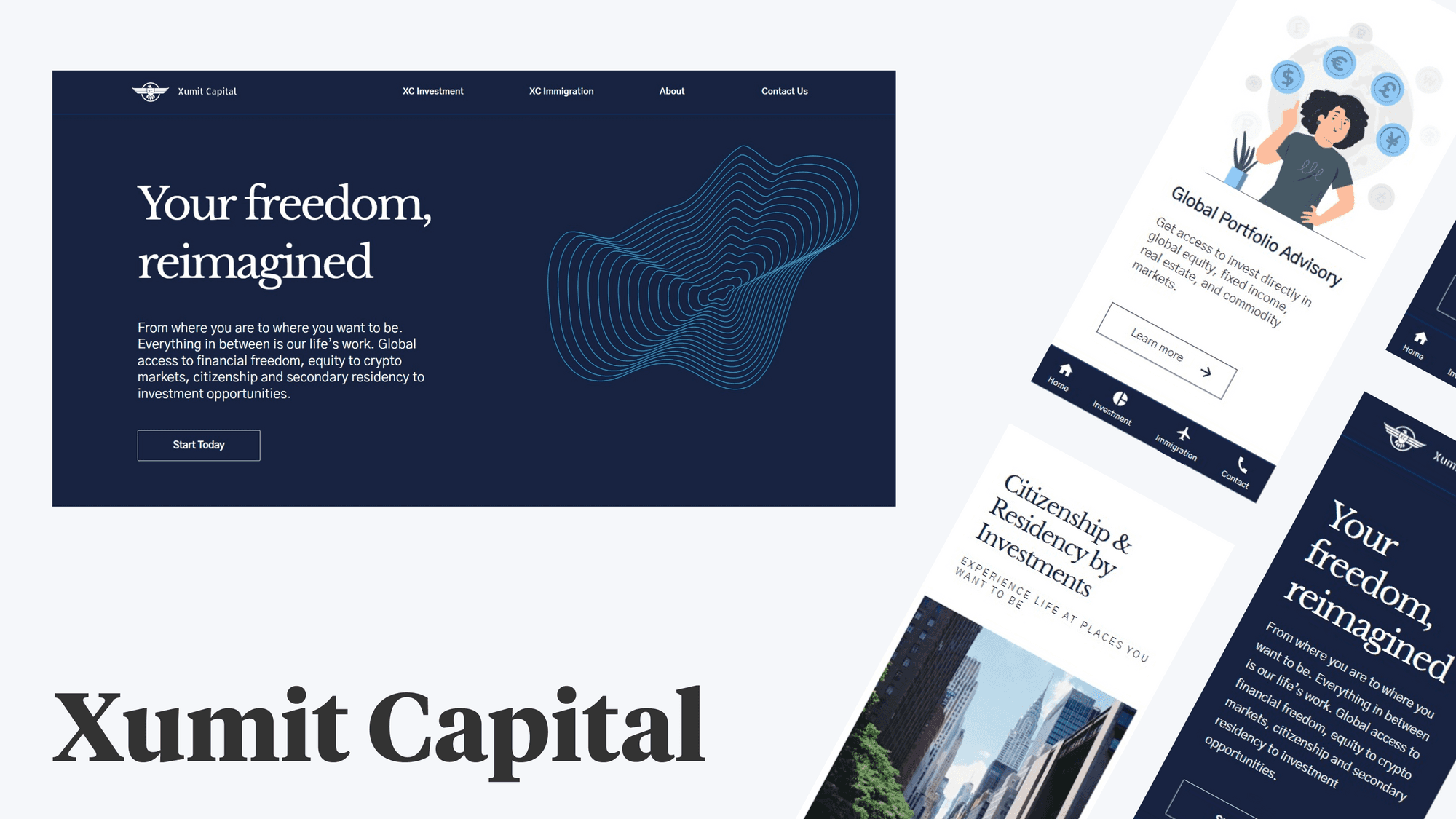
Taking into consideration the customer persona, we designed a premium customer experience that focuses on faster loading time and frictionless content experience. To ensure that, we developed the website using React.js. For caching the images where the users are, we used AWS Cloudfront, further creating a seamless experience.
Final Product
Home Page
The home page clearly gives a glimpse of the value proposition to the customer. Designed to delight and engage customers with a simple interface and elegant layout.
Country Page
Designed with a focus on presenting complex and analytical information with simplicity, crucial in decision making for the customer.
Reflection
Talking to customers becomes crucial to build empathy, which helped us stay focused on user experience.
Building a design and technology first brand experience poses significant challenges, especially during the discovery phase. These challenges include building an understanding of the customer needs, testing technologies that provides the desired experience and creating the foundational design system that guides both design and development teams.


